Do you feel calm around blue? What about regal around purple? Interior designers understand how color can affect your feelings, emotions, and mood, using color as a way to influence and communicate what they want. Although your personal feelings about certain colors are often rooted in things like your own culture or experiences… your love of camping, for example, might mean you feel warmer towards greens. But whether you’re a fan of warmer or cooler colors, the colors you choose in your home can affect your mood year around.
Green for Work
Green is a restful color for eyes and means the least amount of eyestrain. It’s often best used in work spaces, like a home office. Windows with green elements, whether green in color or with a greenish tint, can work well here too. Add a few green knickknacks around your laptop or desk computer, as well as some actual greenery indoor plants help reduce pollutants and provide life into otherwise duller spaces.
Red for the Bedroom
There’s a reason why red roses are the flowers of love, or why red invokes feelings of passion. It stirs up excitement, and there’s no place better for excitement than the bedroom. Go for a muted red here, like a deep burgundy, as opposed to a bright lipstick red, since it could be too stimulating. If you’re more into the idea of using your bedroom for sleeping, consider adding a pop of red in the hallway or entryway, particularly anywhere that connects living and dining rooms, or other heavily trafficked rooms.
Yellow for the Kitchen
Sunny yellow is ideal in joyful places where there’s lots of hubbub, like the kitchen. It’s welcoming and uplifting, and works best as an accent to other light colors. Brighten the room with yellow tints on the windows, or stripes of paint. Yellow accessories are also a good idea, such as kitchenware, vases, or furniture. Additionally, if you’re looking to energize the bathroom, yellow works well.
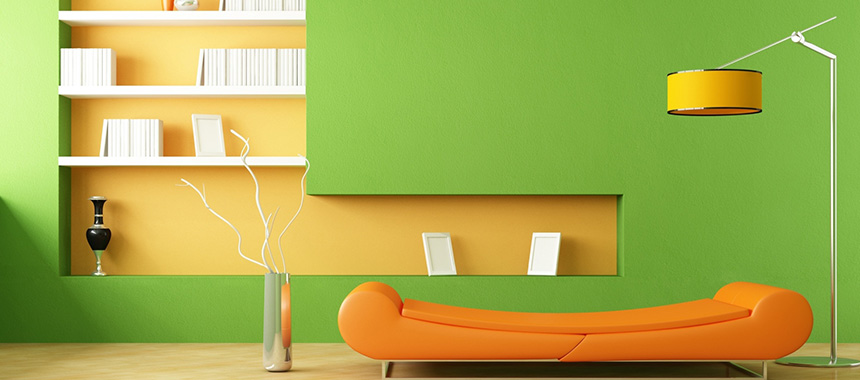
Orange for the Basement
Have some workout gear down below you’re not using? Hop on that stationary bike and get your blood pumping with hints of orange. It’s an overwhelming color, but it’s a stimulating one, making it the perfect color companion to your workout routine.
Purple for Accents
As the darkest color on the spectrum, purple invokes drama and sophistication. It’s a creative color, so try it as an accent in a sewing or sitting room. It’s also a great secondary color in spaces that need an extra dose of luxe, such as the dining room. Lighter purples like lavender offer a relaxing quality like blue, so consider paler shades to spruce up the bedroom.
Blue for Anywhere
Because blue is considered calming and serene, it will work well in any space in your home. It’s seen most often in bedrooms and bathroom, but looks just as lovely in dining rooms, home offices, and family rooms.
Try mixing up different blue paints accents of darker navy for the guest room, for example, is more dramatic, while the bedroom may be served best by a warmer blue like a periwinkle. Blue is also a popular window color choice, whether for the front door, bathroom, or other space.
Don’t worry about housing color trends, as they come and go. Pick the colors you like best. And no matter what your favorite color is, there are so many creative ways to use it. If you want to add color to your home’s exterior or interior, we’ve got you covered.
Looking for Custom Windows in a color that matches your taste and style? We’ve got it! Vivid Color™ by NT Window offers window and door coatings that come in almost any color of the rainbow giving you endless design choices.